

Learn how strategic color psychology drives 80% of brand recognition and impacts purchasing decisions.
Color increases brand recognition by up to 80%, yet most businesses choose their palette based on personal preference rather than strategic psychology. After developing visual identities for brands from craft breweries to luxury beauty services, I've witnessed firsthand how the right color strategy transforms market perception—and the wrong one kills conversions before customers even realize why they clicked away.
The Science Behind Color Perception
Your brain processes color 60,000 times faster than text, making your brand palette the first and most visceral connection with potential customers. This isn't just artistic theory—it's documented neuroscience that directly impacts your bottom line.
Different colors trigger specific psychological responses rooted in both evolutionary biology and cultural conditioning. Red increases heart rate and creates urgency (why it dominates sale tags and fast food), while blue activates the parasympathetic nervous system, promoting trust and calm (explaining its dominance in financial and healthcare sectors).
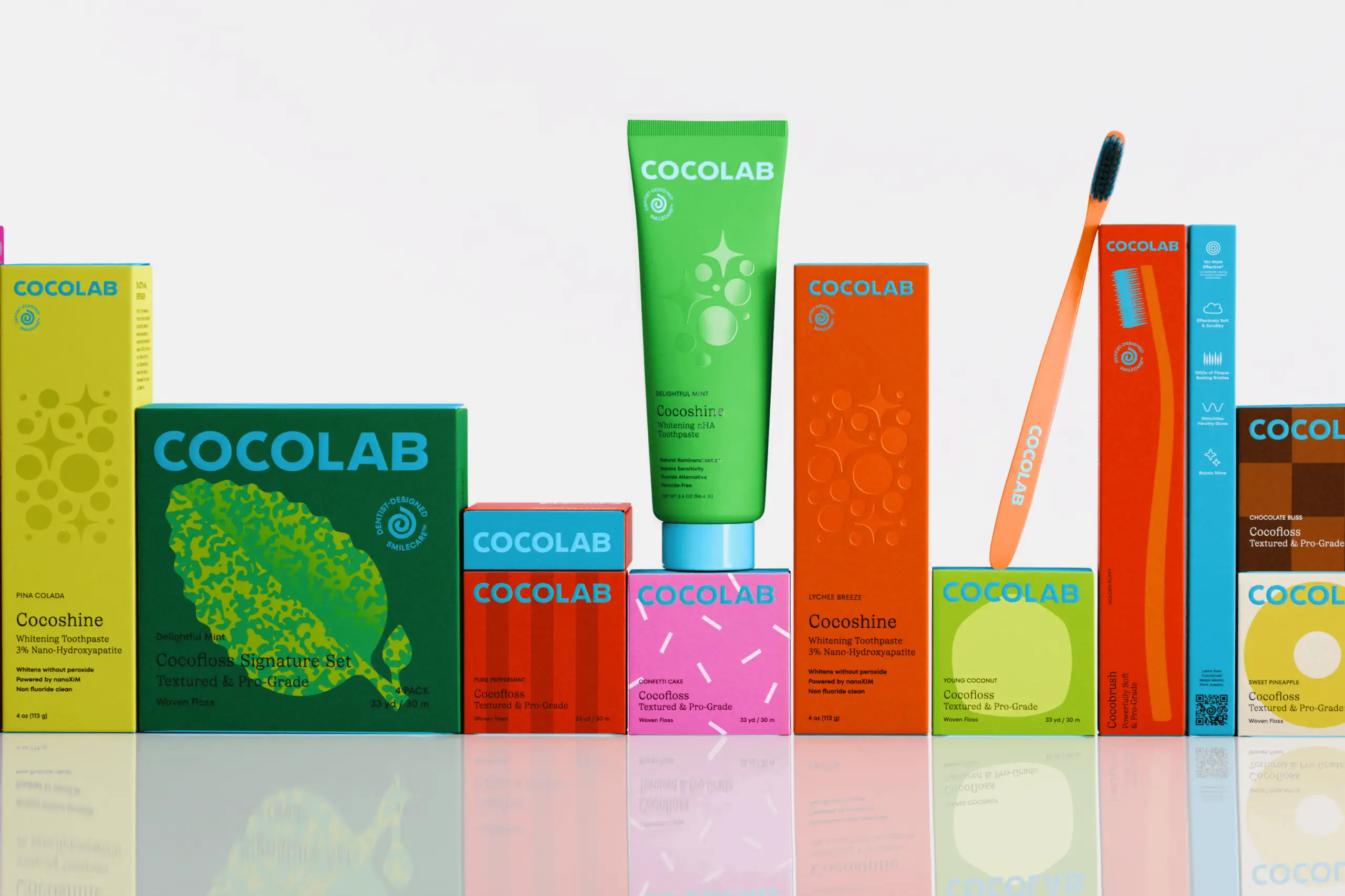
Industry-Specific Color Strategies That Actually Work
Craft Beverage Brands: The craft beer and spirits industry has moved beyond brown-and-gold traditionalism. Modern craft brands leverage unexpected palettes—like Tarantula Hill Brewing's bold combinations—to signal innovation while maintaining craftsmanship cues through strategic accent colors.
Wellness and Beauty: The outdated "spa blue and white" standard is giving way to bold, confidence-inspiring palettes. Tokyo Bikini Bar's vibrant identity challenges beauty industry norms while maintaining professional trust through strategic color balance.
Food Service: Restaurant brands must balance appetite appeal with brand differentiation. Pizza Cookery's rebrand demonstrates how heritage restaurants can modernize their palette without losing generational recognition—keeping familiar base colors while introducing contemporary accent hues.
The 60-30-10 Rule for Digital Applications
Your brand needs more than just pretty colors—it needs a systematic application strategy. The 60-30-10 rule creates visual hierarchy across all touchpoints:
60% Dominant Color: Your brand's foundation, typically neutral or primary brand color
30% Secondary Color: Supports and complements, creating visual interest
10% Accent Color: Drives action on CTAs, highlights key information
This formula scales from website design to packaging, ensuring consistency while maintaining flexibility for different applications.
Cultural Context: When Blue Means Death and Red Means Luck
Color psychology isn't universal. While white symbolizes purity in Western markets, it represents death in many Asian cultures. Red signals danger in the US but prosperity in China. Brands expanding geographically must audit their palette through cultural lenses or risk sending unintended messages.
Testing Your Color Performance
Stop guessing and start measuring. A/B test color variations on critical conversion points:
CTA button colors (orange outperforms green by 32% on average)
Email header backgrounds
Product photography backgrounds
Social media template colors
Tools like Hotjar and Crazy Egg provide heatmap data showing how color influences user behavior patterns you'd never consciously notice.
Conclusion: Your Colors Are Speaking—Make Sure You Like What They're Saying
Color isn't decoration—it's communication. Every palette choice either reinforces or undermines your brand promise. Whether you're launching a new brand or revitalizing an established one, strategic color psychology transforms subjective preferences into objective performance metrics. The question isn't whether you like your brand colors—it's whether they're working as hard as you are.

Let’s keep in touch.
Discover more about high-performance web design. Follow us on Twitter and Instagram.