When Your Brand Name Becomes Your Biggest Limitation: Inside the Cocolab Rebrand
There's a moment in every brand's evolution where success becomes its own constraint. For Cocofloss—a cult-favorite dental floss brand beloved by Gwyneth Paltrow's goop and beauty editors alike—that moment arrived when their product line outgrew their name.
Founded in 2015 by sisters Dr. Chrystle Cu (a dentist) and Cat Cu (an artist), Cocofloss built a devoted following with something as simple as it was revolutionary: dental floss that people actually got excited about. Their textured, loofah-like floss in flavors like confetti cake and chocolate proved that even the most mundane daily ritual could spark joy.
But when you've built your brand around a single hero product and you're ready to become a complete oral care system—with toothbrushes, toothpaste, and an entire product ecosystem—the name "Cocofloss" becomes a limitation rather than an asset.
The Challenge: Breaking Out Without Breaking Trust
This is where rebranding gets interesting. Montreal and LA-based studio Wedge was tasked with evolving Cocofloss into Cocolab, maintaining the brand's established cachet while supporting an expanded vision. The strategic brief was clear but challenging: create a complete oral care brand worthy of the MoMA store.
What emerged is a masterclass in strategic brand evolution. The new positioning—"Your daily hit of dental dopamine"—puts pleasure and efficacy on equal footing, a calculated bet that oral care can be disrupted not through better ingredients or scientific claims, but through genuine pleasure.
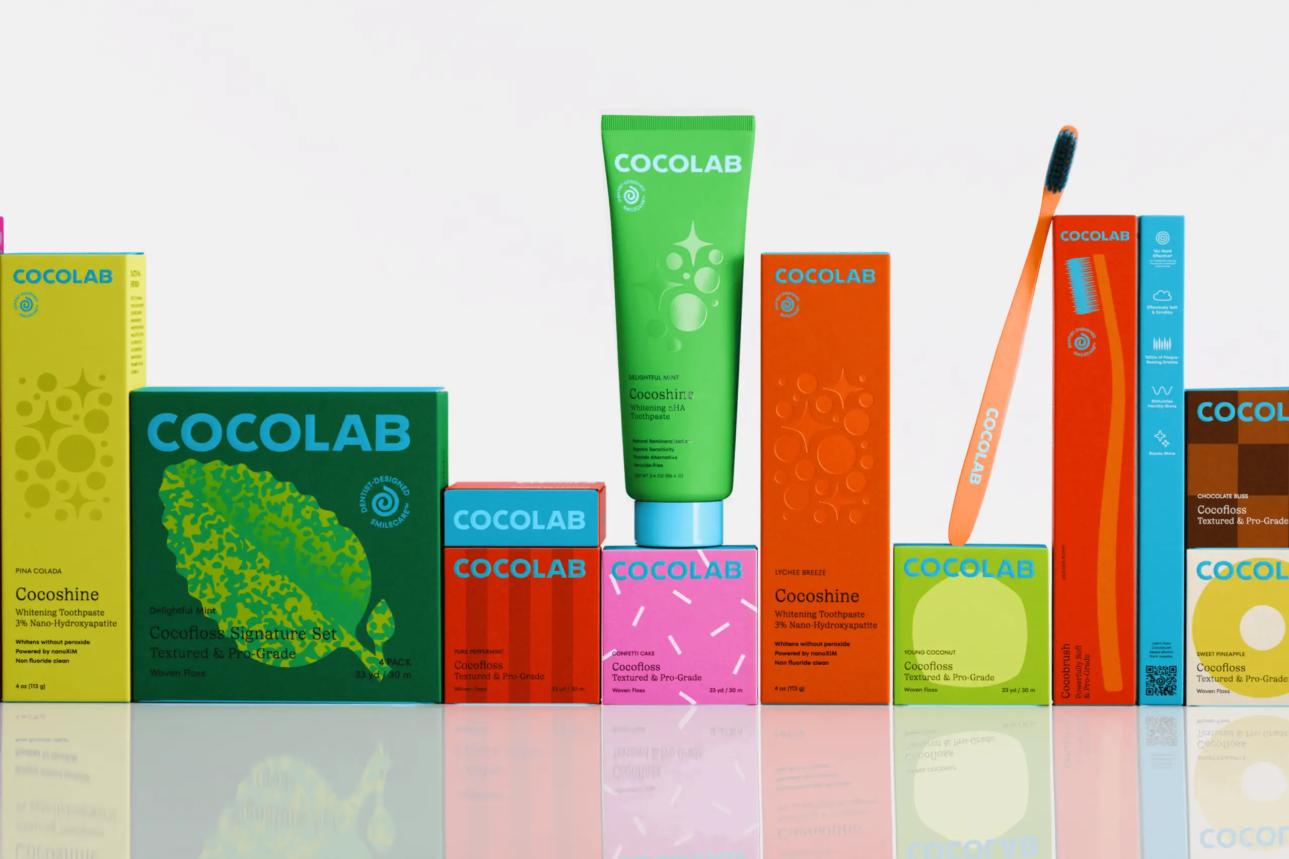
Design That Defies Category Conventions
Where traditional oral care leans into sterile whites and predictable blues, Cocolab embraces vibrant, saturated color that mirrors the brand's adventurous flavor profile. Lychee and pineapple toothpaste. Cara cara orange and chocolate floss. The strategic role of color here is to deliver the emotion of enjoyment—shifting from a routine you "have to do" to one that makes you feel damn good.
But here's the nuance: the aesthetic isn't anti-dental, it's anti-establishment. It deliberately subverts "big toothpaste" conventions while maintaining essential trust signals. Wedge paired an elevated serif with a clean sans serif, ensured clear messaging and call-outs, introduced performance-related symbols, and prioritized the "dentist-designed" credibility throughout the system.
The MoMA-Ready Standard
This phrase—"MoMA-ready"—appears repeatedly in Cocolab's brand language, and it's telling. It's not about designing products that could theoretically end up in a museum gift shop. It's about creating everyday objects with the same intentionality, craft, and thoughtfulness that museum curators demand.
For Cocolab, this means every touchpoint—from packaging to digital presence to the actual product experience—is designed to be shown off. It's the kind of oral care you leave on your bathroom counter rather than hiding in a drawer.
The Ecosystem Approach
What makes this rebrand particularly successful is its systems thinking. Wedge didn't just redesign packaging or refresh a logo. They created a complete brand ecosystem that supports product expansion while maintaining coherence. The visual identity system is flexible enough to accommodate new products without diluting the core brand essence.
This is something we think about constantly at tono®. A rebrand isn't just about making things look new—it's about building a framework that allows a brand to grow, evolve, and scale without losing what made it special in the first place.
The Market Positioning
Cocolab positions itself in what we'd call the "mass-premium" space—elevated enough to justify higher price points and cross over into beauty retail (they're stocked at Violet Grey, The Detox Market, Credo, and Urban Outfitters alongside traditional channels like CVS), yet approachable enough to transform mainstream oral care habits.
Their retail footprint tells the story: you'll find Cocolab at luxury Palm Beach resort The Breakers (full-size Cocofloss in every guest suite) and at your local drugstore. That's strategic positioning that expands market reach without compromising brand perception.
Why This Matters
The Cocolab rebrand represents something larger than just changing a name. It's a case study in how brands can evolve beyond their original product without alienating their core audience. The challenge wasn't just expanding the product line—it was reframing the entire category.
By treating daily dental care as an experience worth designing for rather than a chore to endure, Cocolab positions itself as the standard-bearer for the next generation of wellness brands. The success hinges on that delicate balance: elevated enough to justify premium positioning, playful enough to honor the cult following, and credible enough that when Dr. Cu promises these products will rebuild your oral health, customers believe her.
For brands considering expansion or evolution, the lesson is clear: your name might be your biggest asset—until it becomes your biggest limitation. The key is knowing when to make the leap, and having the strategic vision to do it right.

Let’s keep in touch.
Discover more about high-performance web design. Follow us on Twitter and Instagram.